Manifesto Year 2

Manifesto Dec 2013

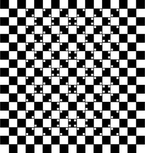
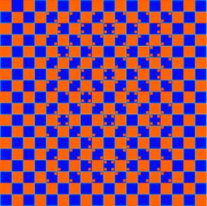
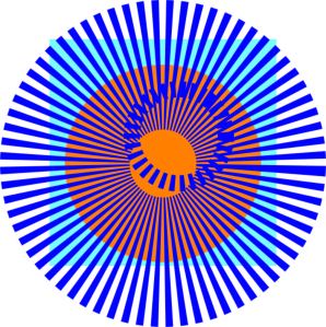
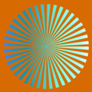
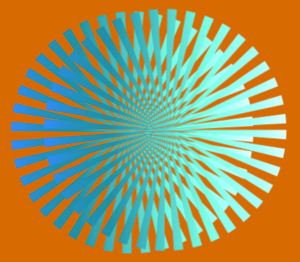
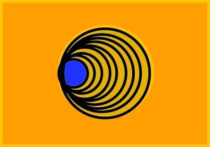
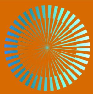
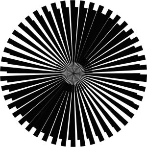
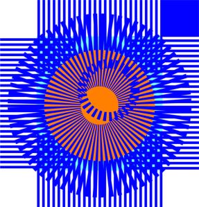
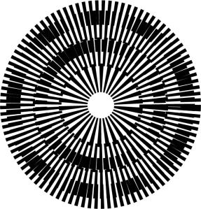
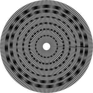
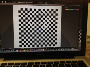
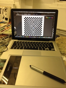
Analyzing perception and how the mind translates what the human eye sees.  The brief was to create a piece that translates how the human eye can easily be confused.  I created a few optical illusions.  I used a simple circle shape to create these illusions.  The circle is quite representative of the circles of hell from Dante’s Inferno.  I created a number of images using Illustrator software.  I felt this was a perfect opportunity to finally learn some of the basics of Illustrator whilst meeting the brief.  I created the pieces in black and white first then started to experiment in colour.  I found that the complimentary colours orange and blue worked quite well together however black and white seemed to be to be the best.

I presented my work projected onto a wall on the day.  I got really good feedback which is alway great.

The Pieces that I Produced and Presented for Manifesto
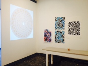
Manifesto Presentation Day

Manifesto Presentation Day

Optical Illusion - not my however I recreated it to experiment with different colours. Black and white seem to work best.

Optical Illusion – not my however I recreated it to experiment with different colours. Black and white seem to work best.

Optical Illusion - Using Complimentary Colours

Optical Illusion – Using Complimentary Colours

Optical Illusion  - Using Complimentary Colours

Optical Illusion – Using Complimentary Colours

Optical Illusion  - Using Complimentary Colours

Optical Illusion – Using Complimentary Colours

Optical Illusion  - Using Complimentary Colours

Optical Illusion – Using Complimentary Colours

Optical Illusion  - Is it going in or out?

Optical Illusion – Is it going in or out?

Optical Illusion  - Using Complimentary Colours

Optical Illusion – Using Complimentary Colours

Optical Illusion

Optical Illusion

Optical Illusion  - Using Complimentary Colours

Optical Illusion – Using Complimentary Colours

Optical Illusion

Optical Illusion

Optical Illusion

Optical Illusion

IMG_8880 IMG_8879

Leave a comment